Why Old Ads Make More Sense Than New Ones
Clarity Was Once Part of the Offer
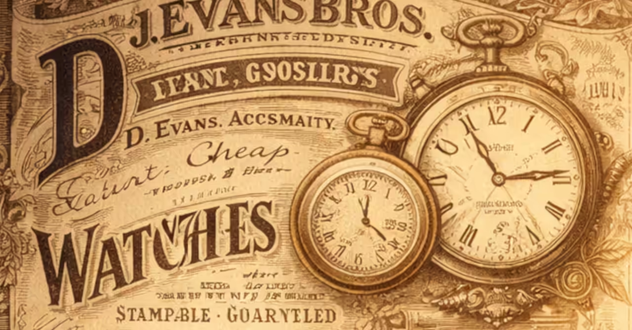
Old advertisements often make more sense than new ones because they were written closer to the object itself. That is the central relationship worth noticing here. A vintage advertisement does not merely try to generate desire. It usually tries to explain what the thing is, what it does, who it is for, and why its particular construction or quality should matter. The page may still persuade, but it persuades through legibility. In many cases the reader is being asked to understand before being asked to admire.
This gives older advertising a distinctive tone. The claims may be earnest, ambitious, or occasionally overconfident, yet the material often remains anchored to practical use. A tool, a textile, a patent fitting, a stove, a type of paper, a medicinal compound, or a household device is presented as something with a place in daily life. There is a problem to solve, a task to improve, a process to support, or a standard to meet. The advertisement therefore carries description, comparison, and context. It assumes that explanation is part of selling.
Many modern advertisements operate differently. They often place atmosphere before description and identity before function. They may suggest a mood, a lifestyle, or a social alignment while leaving the actual thing oddly vague. The result is not always empty, but it is frequently less informative. The older page, by contrast, tends to keep one foot on the ground. It may still flatter the buyer, yet it also gives the reader something firmer to hold.
Older Ads Had to Make the Product Legible
The deeper reason for this difference lies in the conditions under which the advertisement had to work. In the late nineteenth and early twentieth centuries, many goods still needed introduction. New devices entered homes, workshops, farms, and offices at different speeds. Standards were developing, product categories were stabilising, and buyers were often making decisions without the benefit of instant comparison, video demonstration, or customer review. The printed advertisement had to carry more explanatory weight. It was not enough to catch attention. The page had to bridge distance between maker and user.
That necessity shaped the writing. Copy often included material descriptions, dimensions, use cases, price structures, distribution terms, endorsements, and references to patents or awards. Illustrations were not only decorative. They helped the reader recognise form, scale, fittings, and arrangement. Even when the language was promotional, it remained connected to the physical or practical nature of the goods. This made the advertisement easier to understand because understanding itself was part of the commercial transaction.
There is also a cultural point here. Older advertising frequently assumed a reader who wished to be addressed as a capable judge. The copy might explain why one product was stronger, cleaner, more efficient, or more economical than another. It invited comparison. It respected the possibility that the reader would weigh qualities rather than merely absorb impressions. That habit gave many advertisements a kind of honesty in form, even when the salesmanship remained lively.
Description was doing part of the selling
One reason old advertisements read clearly is that description was not treated as a burden. It was part of the offer. A page for a machine might identify its parts, operating advantages, and fields of use. A page for dress goods might specify fabric type, finish, and intended wear. A page for household fittings might show exactly how the item sat within a room or joined with another object. Such copy assumes that clarity helps create confidence.
This is especially visible in trade journals and catalogues, where the reader was expected to care about performance, compatibility, or method. Yet even general magazine advertisements often retain this habit. They tell the reader what is being sold in more than one register. There is the name of the thing, the picture of the thing, the problem it addresses, and the reason it claims to do so well. The argument is built from recognisable parts.
That makes old advertising unusually useful to modern readers. Even when we do not intend to buy the product, we can still understand the proposition. The page remains readable because it is structured around an object in use, not around a detached emotional aura. Its persuasion is tied to explanation.
Modern ambiguity often shifts attention away from the object
By contrast, many modern advertisements seek effect through compression. The image is strong, the slogan is brief, and the product itself may retreat into the background. In some fields this is understandable. Mature markets often assume that basic product knowledge already exists. Branding then becomes a way of distinguishing near equivalents. But the cost of this shift is that the advertisement can become harder to read in a practical sense. It communicates position without always communicating substance.
There is also a difference in how desire is framed. Older advertisements frequently connected desire to utility, improvement, or durability. Modern advertising often links desire to identity, aspiration, or belonging. Neither method is free from artifice, but they produce very different reading experiences. The first invites the question, what does this do. The second invites the question, what does this say about me. One is object-facing. The other is audience-facing.
That helps explain why vintage ads can feel refreshingly direct. Their intentions are still commercial, but the route they take is often easier to follow. They show their workings a little more plainly. They disclose more of the link between product and claim.
Vintage clarity makes these pages worth reading now
This older style of advertising matters beyond nostalgia. It means these pages can still teach. They reveal not only goods, but expectations. They show what buyers were thought to value, what makers believed needed explanation, and what level of technical or social knowledge could be assumed. A well-made vintage advertisement becomes a compact lesson in materials, habits, standards, and commercial culture.
That is why such pages are more than graphic curiosities. Their clarity makes them useful for interpretation. They can help readers understand old technologies, domestic routines, workshop practices, and patterns of taste. They can also sharpen our reading of the present by showing that opacity in advertising is not inevitable. It is a choice shaped by market conditions and cultural habits.
To say that old ads make more sense than new ones is not to claim that the past was purer or more truthful. It is to recognise that many older advertisements still place the object where the reader can see it. They explain, compare, and situate. In doing so, they remain readable long after their original market has vanished. The next useful step is to read a few of them slowly and ask a simple question of each page: what must the reader understand here before the seller can hope to persuade. That question opens the advertisement back into the world that produced it.
Author's Notes
Notes & Memoranda
Further Reading…



Disclosure
This article presents an interpretive reading of historical advertisements and related material, with attention to their technical, cultural, and practical context. It reflects editorial analysis rather than a definitive account of historical practice. Readers seeking primary context should consult period sources and surviving examples.